
News.
Ideas and practical perspectives on materials, signage and spaces.
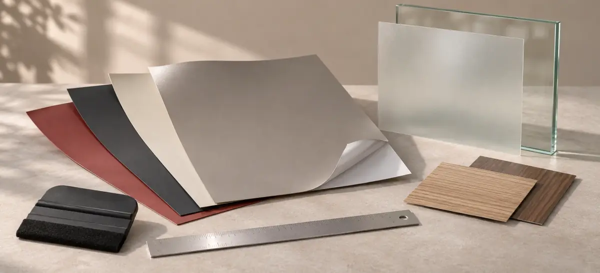
Translucent or opaque: choosing a film
Translucent and opaque films do more than change how bright a graphic appears. The right choice depends on the light source, substrate and intended brand colours. This article outlines the application questions, installation conditions and sample checks that help clarify a material brief.
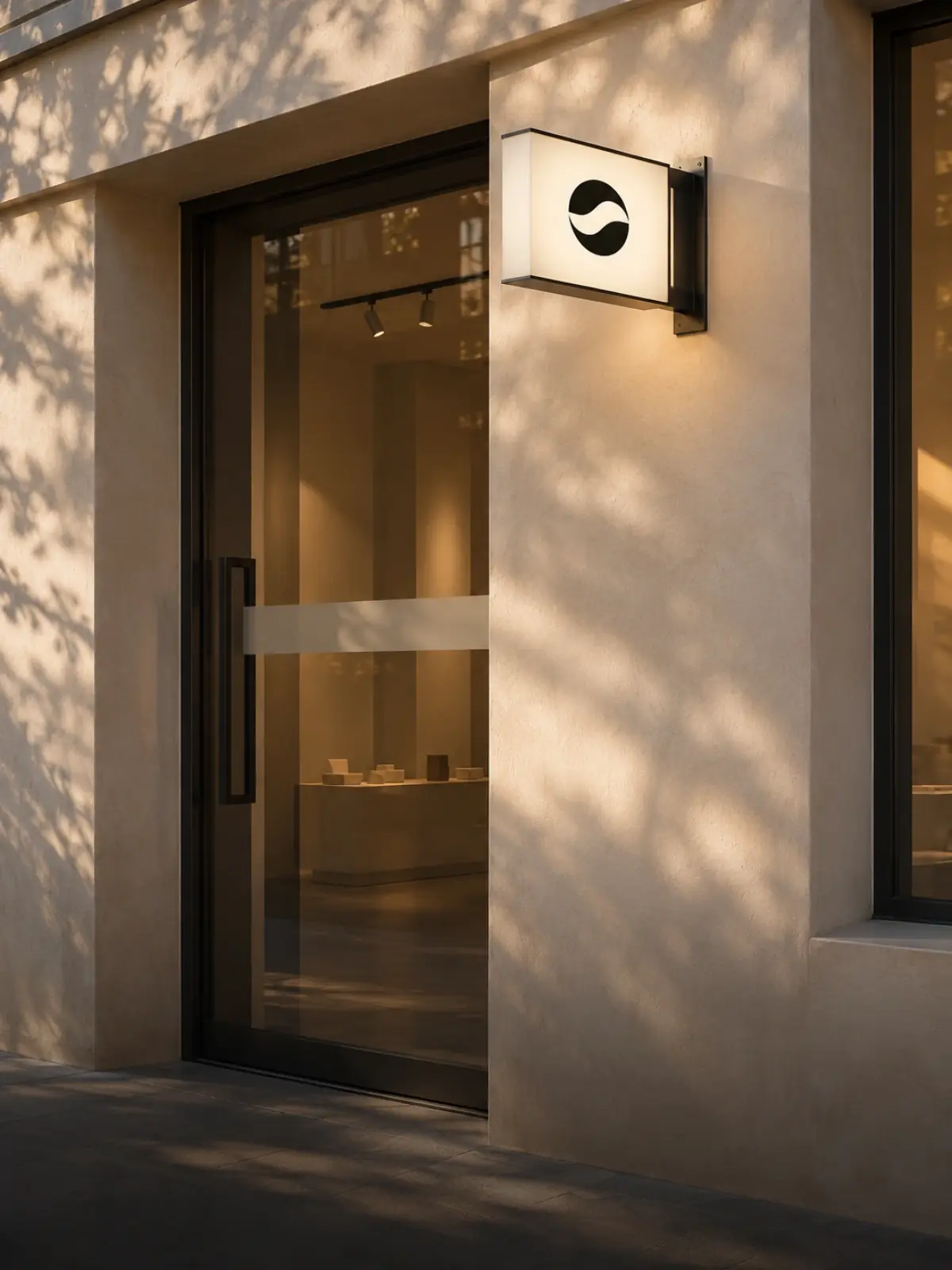
Making a minimal storefront stand out
A minimal storefront can still make a clear impression. Scale, graphic contrast and layers of light help signage work naturally with its architectural setting. Explore the design and material considerations that bring a restrained brand identity into focus.
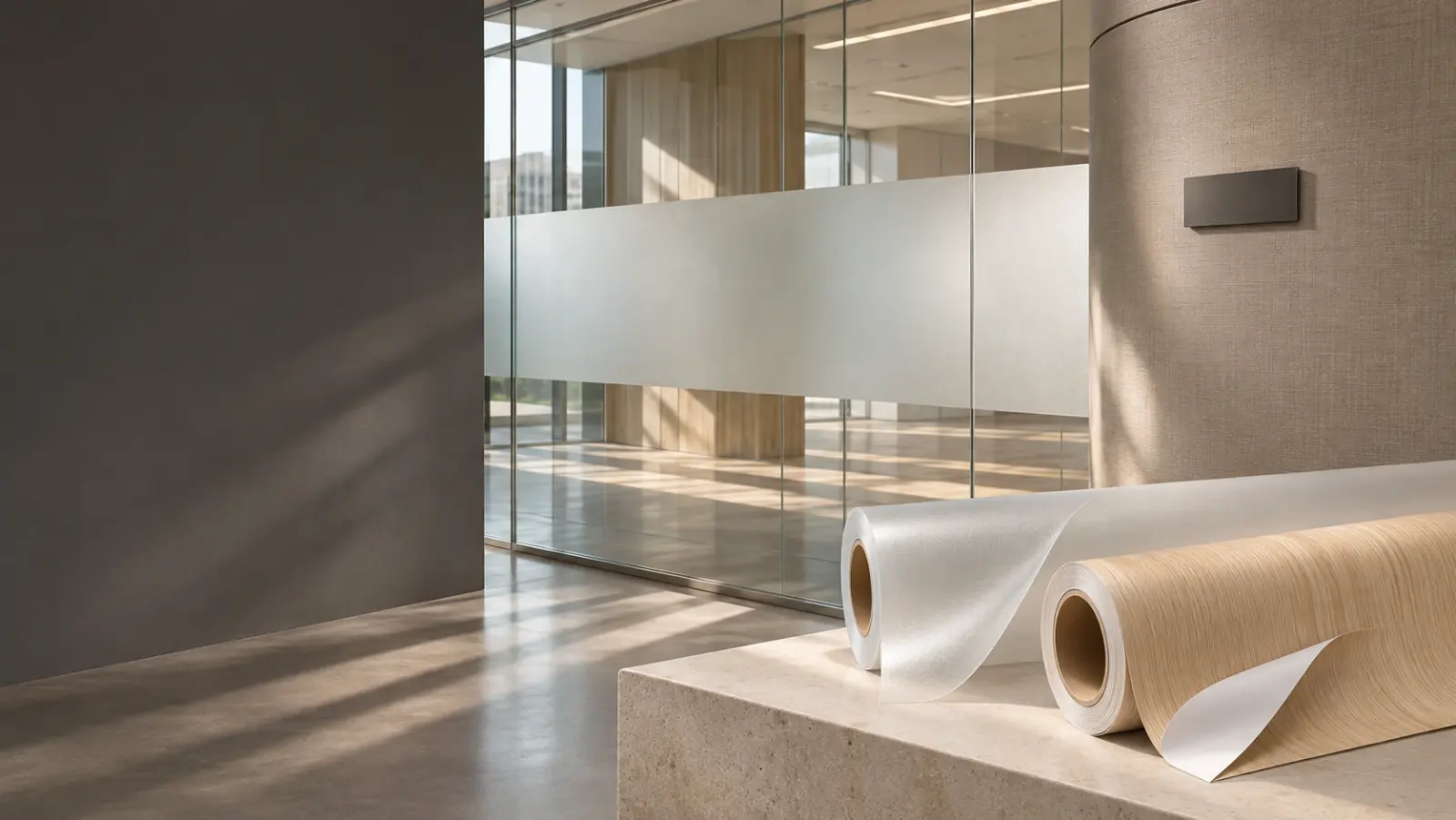
Glass film: balancing daylight and privacy
Decorative glass films can preserve a sense of openness while providing visual screening. From frosted finishes to carefully placed graphics, explore how daylight and site conditions affect the result, and what to check when selecting samples and preparing for installation.
A checklist before your material enquiry
A clear material enquiry starts with the right project information. Application details, dimensions, substrate conditions and delivery requirements help a team understand the brief. Use this practical checklist to prepare a more focused conversation and identify the next steps.
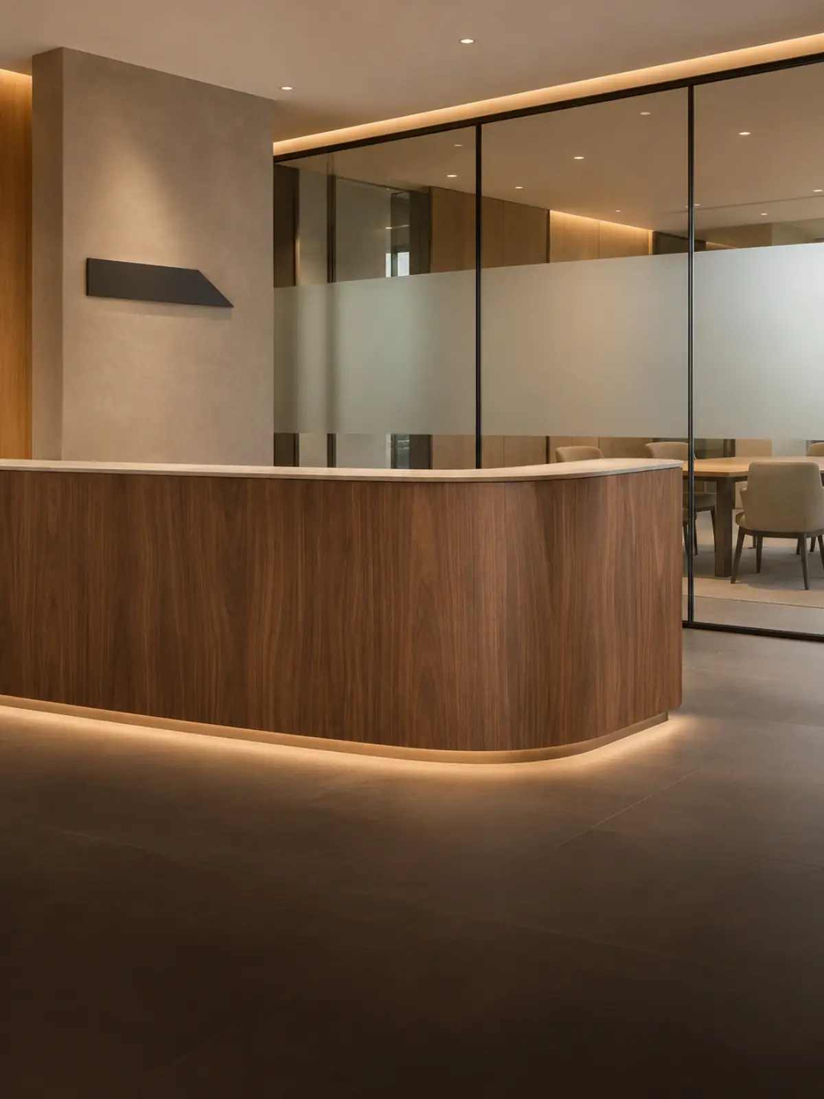
Warm commercial spaces with woodgrain finishes
Woodgrain finishes can bring warmth to a commercial interior when they work with the lighting, neighbouring materials and installation details. Explore colour, texture and curved surfaces as part of a consistent material palette for the space.
No matching stories.